
Altair Library
Altair is a declarative statistical visualization library for Python, based on Vega and Vega-Lite, and the source is available on GitHub.
With Altair, you can spend more time understanding your data and its meaning. Altair’s API is simple, friendly and consistent, and built on top of the powerful Vega-Lite visualization grammar. This elegant simplicity produces beautiful and effective visualizations with a minimal amount of code.
Code sample
# # Get data
import pandas as pd
import altair as alt
df = pd.read_csv("../../data/raw/StudentsPerformance.csv")
df.head()
df.columns = [
col.replace(
" ",
"_",
)
for col in df.columns
]
# # Visualize
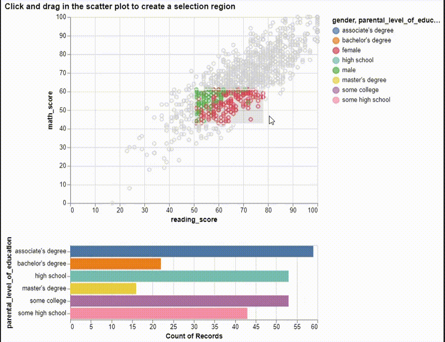
# ## Scatter Plot and Horizonal Bar Plot
brush = alt.selection(type="interval")
points = (
alt.Chart(df)
.mark_point()
.encode(
x="reading_score:Q",
y="math_score:Q",
tooltip=["gender", "reading_score", "math_score"],
color=alt.condition(brush, "gender:N", alt.value("lightgray")),
)
.add_selection(brush)
).properties(title="Click and drag to create a selection region")
points
brush = alt.selection(type="interval")
points = (
alt.Chart(df)
.mark_point()
.encode(
x="reading_score:Q",
y="math_score:Q",
tooltip=["gender", "reading_score", "math_score"],
color=alt.condition(brush, "gender:N", alt.value("lightgray")),
)
.add_selection(brush)
)
bars = (
alt.Chart(df)
.mark_bar()
.encode(
y="parental_level_of_education:N",
color=alt.Color("parental_level_of_education:N"),
x="count(parental_level_of_education):Q",
)
.transform_filter(brush)
)
alt.vconcat(points, bars).properties(
title="Click and drag in the scatter plot to create a selection region"
)
# ## Bar charts
bars1 = (
alt.Chart(df)
.mark_bar()
.encode(
alt.X(
"math_score:Q",
bin=alt.Bin(maxbins=30, extent=brush),
scale=alt.Scale(domain=brush),
),
y="count(math_score):Q",
)
)
bars2 = (
alt.Chart(df)
.mark_bar()
.encode(
alt.X("math_score:Q", bin=alt.Bin(maxbins=30)),
y="count(math_score):Q",
)
).add_selection(brush)
alt.vconcat(bars1, bars2).properties(
title="Click and drag the bottom bars to zoom in the top bars"
)
# ## Scatter plot and bar plot
points = (
alt.Chart(df)
.mark_point()
.encode(
x="reading_score:Q",
y="math_score:Q",
tooltip=["gender", "reading_score", "math_score"],
)
.transform_filter(brush)
)
bars = (
alt.Chart(df)
.mark_bar()
.encode(alt.X("math_score:Q", bin=alt.Bin(maxbins=30)), y="count(math_score):Q")
.properties(width=500)
).add_selection(brush)
alt.vconcat(points, bars).properties(
title="Click and drag the bottom bars to filter the scatter plot"
)
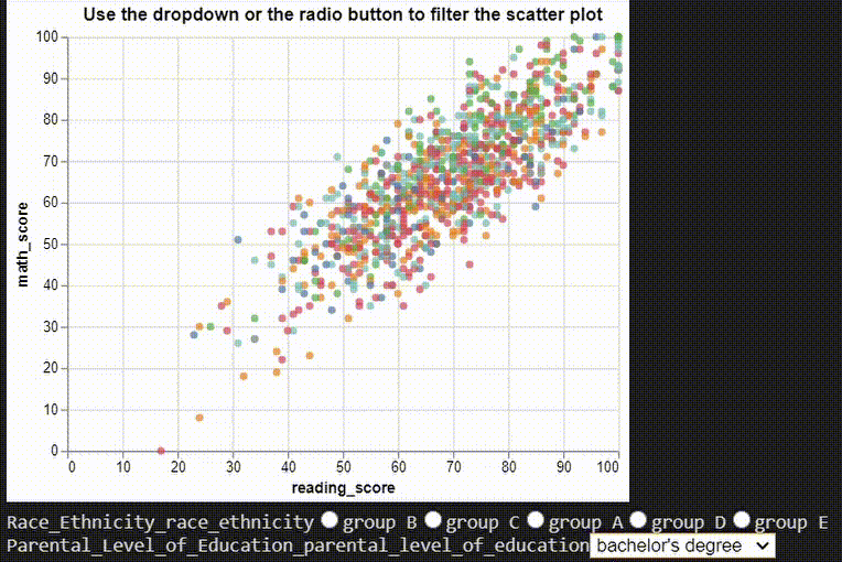
# ## Multiple Interactions
# dropdown filter
parental_educations = df["parental_level_of_education"].unique()
parental_education_dropdown = alt.binding_select(options=parental_educations)
parental_education_select = alt.selection_single(
fields=["parental_level_of_education"],
bind=parental_education_dropdown,
name="Parental Level of Education",
)
# radio filter
ethinicities = df["race/ethnicity"].unique()
ethinicity_radio = alt.binding_radio(options=ethinicities)
ethinicity_select = alt.selection_single(
fields=["race/ethnicity"], bind=ethinicity_radio, name="Race/Ethnicity"
)
ethinicity_color_condition = alt.condition(
ethinicity_select,
alt.Color("race/ethnicity:N", legend=None),
alt.value("lightgray"),
)
# Create scatter plot
chart = (
alt.Chart(df)
.mark_point(filled=True)
.encode(x="reading_score:Q", y="math_score:Q")
.add_selection(parental_education_select)
.transform_filter(parental_education_select)
.add_selection(ethinicity_select)
.encode(color=ethinicity_color_condition)
).properties(title="Use the dropdown or the radio button to filter the scatter plot")
chart